How to combine wooden furniture with glass for a sleek look
Choosing the Right Wood Tones for a Polished Look
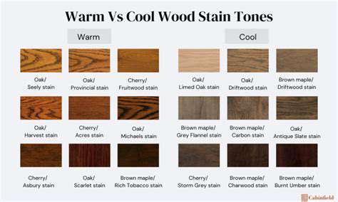
Choosing Warm Tones
Natural wood tones with warm hues bring an undeniable sense of comfort to any space. These earthy shades - from soft beiges to deep chocolate browns - instantly make a room feel more inviting. There's something inherently soothing about warm wood tones that makes people want to linger in a space longer. They work particularly well in areas meant for relaxation, like living rooms or bedrooms, where that cozy atmosphere matters most.
When selecting warm tones, think about the mood you're trying to create. For a rustic farmhouse aesthetic, rich walnut or cherry woods deliver that perfect lived-in charm. Meanwhile, lighter options like honey oak maintain warmth while keeping things fresh and contemporary. The beauty of warm tones lies in their versatility - they can adapt to nearly any design style with the right complementary elements.
Considering Cool Tones
Cool wood tones offer a completely different but equally compelling aesthetic. These gray-washed and pale finishes create clean, modern spaces that feel open and uncluttered. For minimalist designs where every element needs to earn its place, cool wood tones provide that perfect balance of natural texture and restrained elegance.
These tones work especially well in spaces that need to feel larger than they are. The light-reflective qualities of ash or white oak can make even small rooms appear more spacious. In north-facing rooms that don't get much sunlight, cool tones prevent the space from feeling dark or closed-in.
The Impact of Light
Lighting conditions dramatically affect how wood tones appear in a space. Sun-drenched rooms can handle deeper, richer woods without feeling oppressive, while these same tones might overwhelm a dimly lit area. In spaces with limited natural light, lighter wood tones act like natural reflectors, bouncing available light around to create an airier feel. The direction your windows face and the quality of your artificial lighting should both factor into your wood tone decisions.
Matching Wood Tones to Flooring
Your flooring sets the foundation for your entire space's wood tone palette. Rather than matching furniture exactly to flooring, aim for complementary contrasts. A slight variation in tone between floors and furniture creates visual depth while maintaining harmony. If you have light oak floors, consider medium-toned walnut furniture. Dark ebony floors might pair beautifully with mid-tone cherry pieces. This layered approach prevents a flat, monotonous look.
The Role of Furniture
Furniture represents your most visible wood elements after flooring. Thoughtful furniture selection can make or break a room's cohesive feel. When choosing new pieces, consider how their wood tones will interact with existing elements. You might establish one dominant wood tone for large pieces, then introduce secondary tones through accent furniture. This creates rhythm without chaos. Remember that wood grains and finishes matter as much as color - a mix of grain patterns adds organic interest.
Understanding the Variety of Wood Types
The world of wood offers an incredible spectrum of options. Each species has unique characteristics - oak's prominent grain, maple's smooth consistency, cherry's rich patina, walnut's dramatic figuring. These natural variations give wood its soul and prevent perfect uniformity that can feel sterile. When mixing woods, look for shared undertones (warm or cool) to maintain harmony despite differing grains and colors. Sample boards are invaluable for seeing how different woods interact in your actual space's lighting.
Strategic Placement of Glass Elements
Maximizing Light and Visual Space
Glass elements serve as secret weapons for small space design. Their ability to maintain sightlines while defining areas makes them invaluable in modern interiors. When positioned thoughtfully, glass partitions or doors can make a modest room feel expansive by allowing light to travel unimpeded. This quality becomes particularly important when working with wood elements, as the glass prevents the space from feeling too heavy or enclosed.
Consider using glass in unexpected ways - perhaps as floating shelves that display objects while maintaining openness, or as interior windows between rooms. The reflection and refraction of light through glass adds dynamic quality to spaces that flat walls simply can't match.
Creating Visual Interest and Depth
Glass does more than disappear - it can actively enhance a space's visual appeal. A glass coffee table, for instance, provides surface area without visual weight, letting the beauty of a wood floor or rug shine through. Glass-front cabinets showcase collections while protecting them, adding layers of interest. The magic happens when light interacts with both glass and wood simultaneously, creating ever-changing patterns throughout the day.
Small glass accents make surprisingly big impacts. Glass drawer pulls on a wooden dresser, or a glass insert in a wooden door, provide subtle sophistication. These details catch the light differently than solid materials, adding sparkle and dimension.
Balancing Warmth and Coolness
The yin-yang relationship between wood and glass creates perfect equilibrium in interior design. Wood brings warmth and organic texture; glass introduces coolness and modernity. This natural partnership allows each material to shine while preventing either from dominating. In rooms with substantial wood elements, strategic glass placements prevent the space from feeling too heavy or rustic.
The transparency of glass also helps contemporaryize traditional wood furniture. A vintage wooden dining table feels fresh when paired with modern glass pendant lights above. This blending of materials across eras creates spaces that feel collected rather than overly styled.
Creating Visual Interest with Glass and Wood Textures
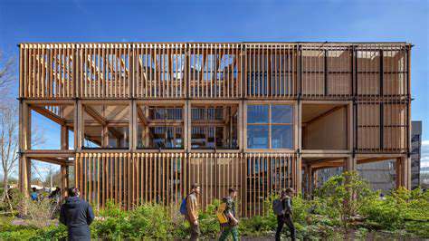
Utilizing Glass in Architectural Design
Architectural glass transforms buildings by manipulating light and space. Its ability to simultaneously separate and connect areas makes it uniquely valuable in design. The most successful glass installations consider not just visibility but also light quality, thermal performance, and acoustic control. When glass reflects surrounding trees or sky, it brings those elements into the architectural experience in magical ways.
Different glass types serve different purposes. Frosted glass provides privacy while transmitting light. Tinted glass reduces glare and heat gain. Textured glass scatters light beautifully. Smart glass can switch between transparent and opaque with the flip of a switch. Choosing the right glass type for each application elevates both function and aesthetics.
Enhancing Interior Design with Glass
Glass transforms ordinary interiors into extraordinary spaces through its light-modifying qualities. A glass staircase, for instance, feels sculptural while maintaining openness. Glass room dividers create separation without isolation. When used to display art or collections, glass becomes an invisible frame that focuses attention on what matters.
In furniture design, glass tops on wood bases merge visual lightness with structural solidity. Glass shelving in wooden bookcases makes stored items part of the decor. Even small glass elements - like cabinet inserts or mirror frames - add refinement through their interplay with wood surfaces.
Exploring Glass's Impact on Natural Light
Natural light affects human wellbeing more than we often realize. Glass serves as sunlight's conduit into our living spaces. Properly designed glass installations can harvest daylight deep into building interiors, reducing artificial lighting needs while boosting occupant mood. The key lies in controlling light without blocking it - using treatments that diffuse harsh sunlight while welcoming soft illumination.
Consider how glass placement affects seasonal light patterns. South-facing glass welcomes winter sun while potentially needing summer shading. North-facing glass provides consistent cool illumination perfect for studios. Every orientation offers unique lighting opportunities through thoughtful glass implementation.
Glass as a Decorative Element
Decorative glass transforms from functional material to artistic medium. Stained glass tells stories through colored light. Etched glass adds delicate pattern. Textured glass creates privacy with style. The best decorative glass works harmoniously with its surroundings while adding a distinctive personality.
Even clear glass becomes decorative through its framing and installation. A wall of framed glass panels can feel like an art installation. Glass tile backsplashes add sparkle to kitchens. Glass mosaic accents bring shimmer to bathrooms. The possibilities are limited only by imagination.
Balancing Transparency and Opacity for Visual Harmony
Understanding the Concept of Transparency and Opacity in Wood
Wood transparency refers to how much a finish reveals the material's natural character. Some woods like ash or oak have bold grains that demand attention. Others like maple or cherry offer subtler figuring. Opacity increases with darker stains or painted finishes that obscure the wood's natural appearance. The most engaging interiors often mix transparent and opaque wood elements to create visual rhythm.
This balance affects perceived weight in a space. Transparent finishes feel lighter; opaque ones feel more substantial. A room full of opaque pieces might feel grounded but heavy, while all-transparent woods could lack anchor points. The art lies in finding the right equilibrium for your space and style.
Choosing Furniture with Complementary Finishes
Furniture finishes should complement rather than compete. If your dining table has a transparent natural finish, consider chairs with more opaque upholstery or painted frames. Contrasting finishes help define individual pieces while creating cohesive groupings. This approach works particularly well in open-plan spaces where different zones need subtle definition.
Finish sheen also affects transparency perception. High-gloss finishes reflect light, enhancing wood's natural transparency. Matte finishes absorb light, increasing perceived opacity. Mixing sheens adds another layer of visual interest to your space.
Using Color and Pattern to Enhance Visual Balance
Color temperature influences how we perceive wood transparency. Warm-toned woods feel more transparent because our eyes associate them with living trees. Cool-toned woods read as more opaque and manufactured. Strategic use of warm and cool woods can create depth and movement in a space.
Pattern plays a similar role. Highly figured woods like birdseye maple or quartersawn oak demand attention, functioning like visual exclamation points. More uniform woods provide calm backdrops. Balancing these creates comfortable visual flow.
Strategic Placement for Maximum Impact
Placement dramatically affects how wood transparency functions in a space. Light-colored transparent woods work well in dark corners where they'll reflect available light. Dark opaque woods can anchor brightly lit areas without disappearing. View wood pieces from all angles in their intended locations before finalizing choices.
Consider sightlines when arranging furniture. A transparent wood piece might frame a view beautifully, while an opaque one could block an important visual connection. Every placement decision should enhance the space's overall flow and function.
Considering the Overall Room Design and Style
Your design style guides transparency/opacity balance decisions. Modern spaces often lean transparent for that light, open feel. Traditional interiors might prefer more opaque, substantial woods. The most successful rooms use transparency and opacity intentionally to support their design narrative.
Don't forget about scale. Large opaque pieces can overwhelm small rooms unless balanced with transparent elements. Conversely, large transparent pieces might lack presence in spacious areas without some opaque anchors. Proportion matters as much as finish.
- Evolution of the Woodworking Industry: From Craftsmanship to High Tech Solutions
- Enhancing Your Space with the Natural Appeal of Wooden Pieces
- How to combine wood furniture with bold interior colors
- Best modern designs for mid century wooden furniture fans
- How to style a small dining area with wooden furniture
- Why custom wooden furniture is growing in popularity
- Best multi functional wooden furniture for compact spaces
- Best wooden furniture for apartments with small spaces
- How to blend wooden furniture with colorful décor
- How to mix modern and vintage wooden furniture in your home
- Best wooden furniture options for large living rooms
- Best wooden furniture options for rental apartments